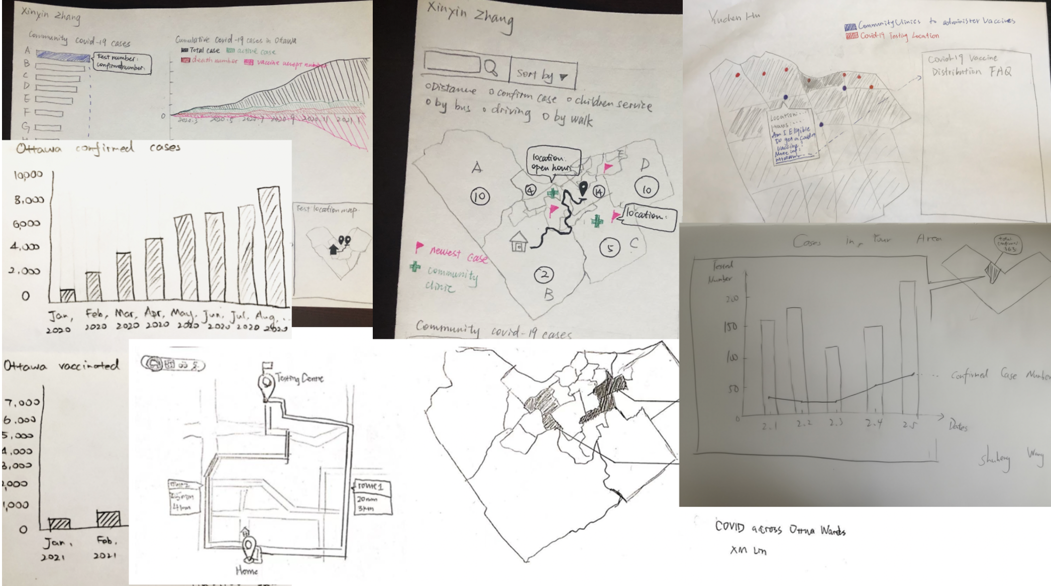
Initial Sketches

As we wanted to show both the Covid-19 testing locations and the confirmed cases in Ottawa, the first common thought we had on our data visualization was a map. For our early sketches, some of us made choropleth maps in order to show the confirmed cases in each neighbourhood, and some of our members created bar graphs and line graphs to show the trend of the cases. The testing locations are also shown on the map. When we were designing the visualization, we realized the vaccines have been distributed to different community clinics, so we would like to show the updated information on the map as well. Besides, we came up with a route planning service that provides users with multiple options of transportations. As there is a lot of information we would like to cover in one map, we decided to create multiple layers. It helps the users filter out particular contents they would not like to know.
Refined Sketches

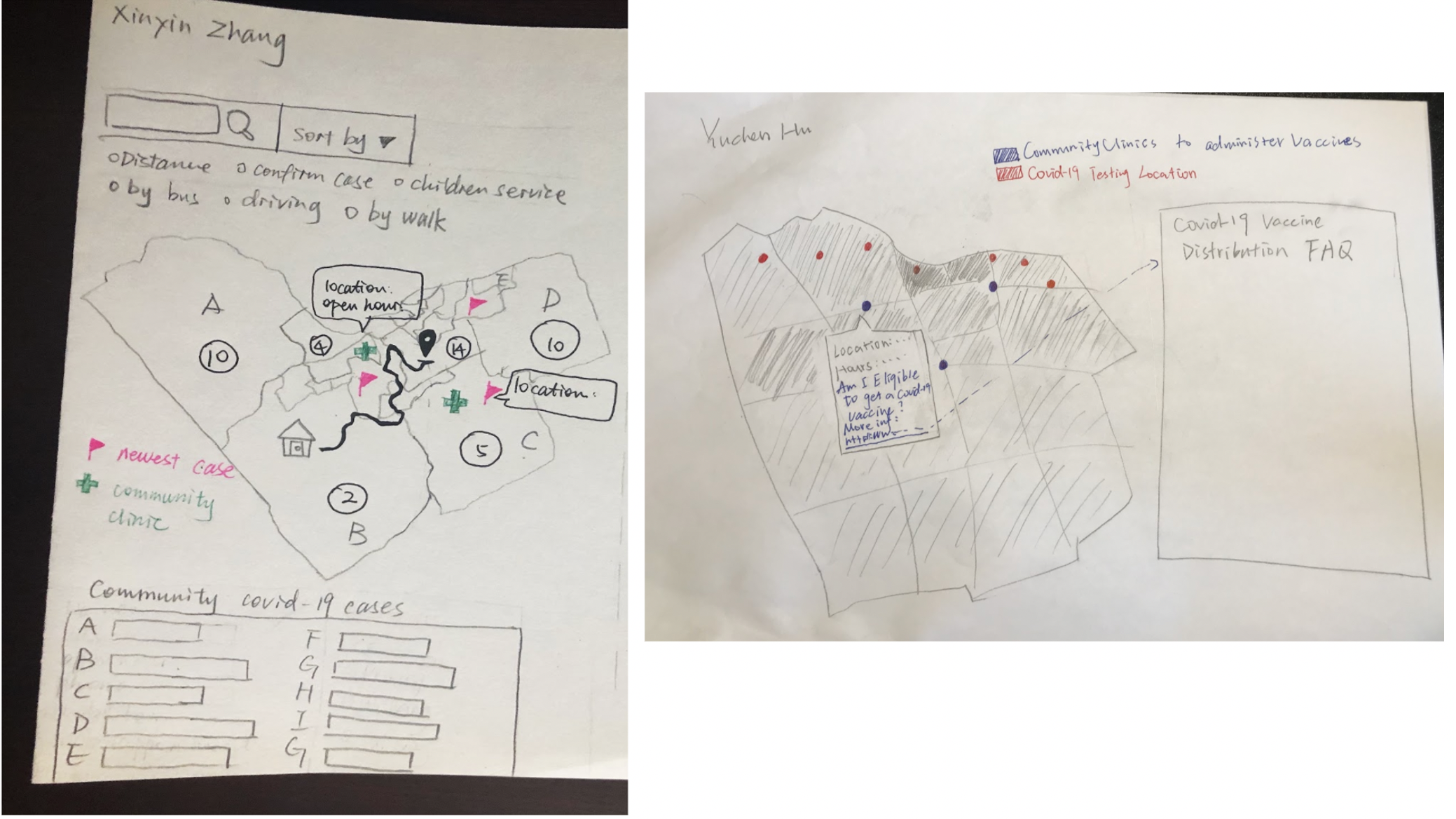
We chose two favourite visualizations from all the sketches, that were created by Xinyin and Yuchen. The reason we chose Xinyin’s sketch is that it covers most of the features, such as route planning service, Covid-19 test locations, vaccine distributions, filter, etc. An extra feature Xinyin designed is a bar chart, which presents the rakings of the confirmed cases in each neighbourhood. It distinctively shows the areas with a higher infection rate. Yuchen designed a choropleth map instead. One thing worth mentioning is the FAQ section for the Covid-19 vaccine. Apart from the locations where people can be vaccinated, people should also know the restrictions and policies before getting the shot. Finally, we combined these features and implemented them on our map.