Map created by Jiaziruo Sun, Shuheng Wang, Xinyin Zhang, Xiaoman Lin, Yuchen Hu

Our group’s website is created with Google My Maps and Tableau. The main purpose of the map is to present the locations of testing and vaccine places in Ottawa and filter these locations according to the users’ preference.
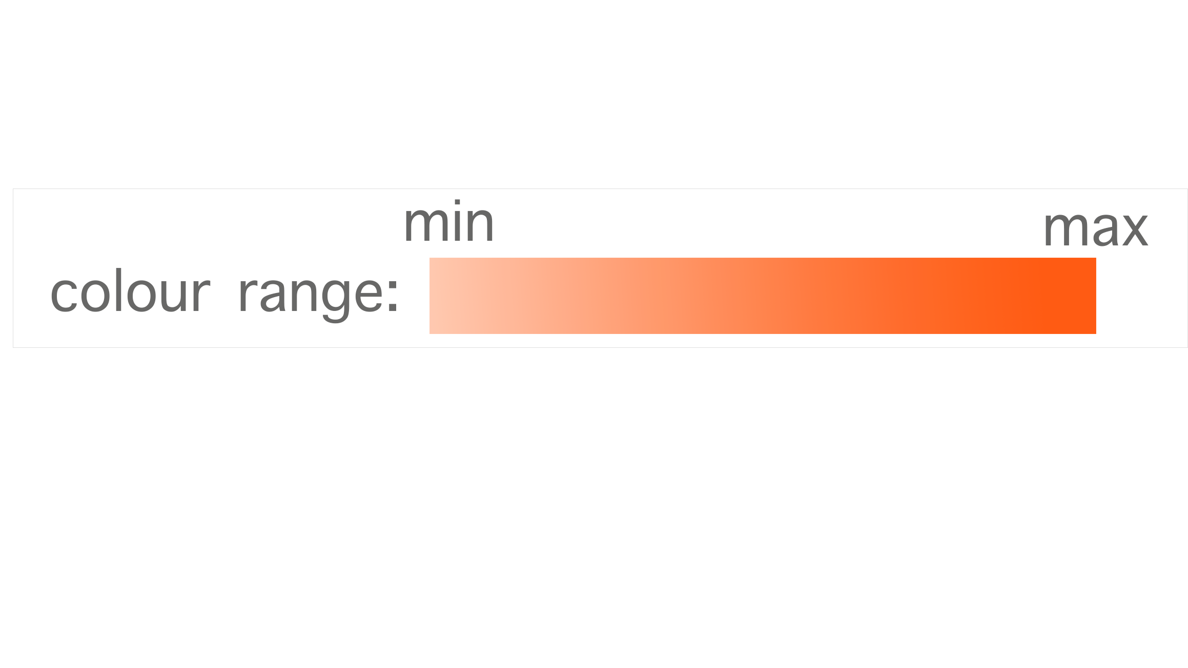
When the users open our website, the map will show the whole Ottawa area marked with all the locations in the database. The users can zoom in and out on the map to view particular neighbourhoods or streets. By clicking the icon on the left top of the map, the users can see a list of filters and choose what kind of locations they want to see. There are six filters in total which are used for three kinds of data. The first four filters are applied to testing centres, which are represented with tube and clipboard icons on the map. The first filter shows all the testing locations while the following three restrict testing locations with special accessibilities including children testing, no symptom testing, and walk-in option. The fifth filter, the Ottawa Neighbourhoods, shows Ottawa neighbourhoods in orange representing the Covid cases in February. The color code, transparency of orange, supports to show the levels of covid case number in different areas. The darker an area is, the more cases it has. To find specific numbers of each neighbourhood, the users can click the down arrow button beside the filter to divide neighbourhoods according to monthly cases. The last filter is for vaccine locations, represented by icons that show a person receiving a vaccine. Our group chose two self-evident icons for the two types of locations so that users can understand their meaning at the first glimpse. The icons are coloured in different hues (grey and blue) which enhances their visual differences.
To further demonstrate the Ottawa Covid cases in different neighbourhoods, our group made an interactive ranking bar chart with Tableau. The users can view the numbers more visually and reorder the bars by clicking the filter button on the left top.
If the users want to know more about any testing or vaccine locations, he/she can click the bubble on the map and more information will be shown in a new column on the left including address, operation hours, phones, etc. Besides, a direction icon will appear on the right top of the column to provide route planning service by leading the users to a Google Map page.
The map and the tableau graph also have a sharing function that allows the users to share the map via Facebook, Twitter, and email or embed the map in other websites.